Abstract
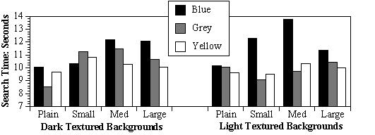
The current study examined the readability of GUI's using four levels of textured backgrounds (plain, small, medium, large), two levels of saturation (dark, light), and three colours (blue, grey, yellow). Participants (N=34) found target words ("square", "circle", "triangle") embedded in the text excerpts (black text) that were placed on top of the textured backgrounds. They responded by clicking on (using the mouse) the corresponding shape located at the bottom of the screen. In general, the plain backgrounds led to faster search times than did the medium-textured backgrounds, and the blue backgrounds led to slower and more variable search times than the grey or yellow backgrounds. The interactions indicate that one can not make simple predictions regarding factors which lead to efficient processing. Further, search times did not correlate with participants' preference ratings of the different stimulus combinations. Designers should keep this in mind when designing software and web pages.
(The full paper is published in the Proceedings for the Second International Conference for Engineering Psychology and Cognitive Ergonomics,1999.)