|
Recently, internet users assisted Dr. Lauren Scharff and student Alyson Hill of Stephen F. Austin State University in Nacogdoches, Texas, with a survey designed to measure the readability of various text/background color combinations. Below is a summary of the results of this survey and a discussion of the research project which was designed to study this topic further. For a summary of the results of the experiment you may access the paper (detailed text; as was published in the Proceedings of the 11th National Conference of Undergraduate Research). |
|
Discussion of Results and Continuing Research |
|---|
|
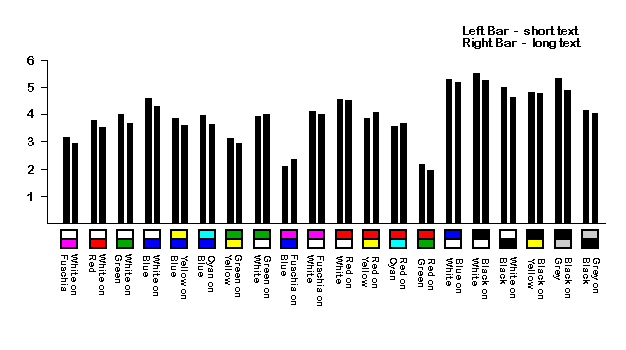
For those of you who kept up with the survey, you might have noticed that we modified the format after about a week. We started with a small background color containing a few words, and switched to a larger background containing a couple sentences. This change was due to observations that a couple of words in one color combination could be perfectly readable, but a large amount of the same color combination could be overwhelming. These two stages of the survey are illustrated using different lines in the graph above. Although there was no statistically significant difference, there was a small trend. Generally, when there was a difference, the larger background with the longer text was harder to read than the small background with the short text. As you can see, the most readable color combination is black text on white background; overall, there is a stronger preference for any combination containing black. The two least readable combinations were red on green and fuchsia on blue. White on blue and red on yellow were ranked fairly high, while green on yellow and white on fuchsia were ranked fairly low. All others fell somewhere between these extremes. Also, in every color combination surveyed, the darker text on a lighter background was rated more readable than its inverse (e.g. blue text on white background ranked higher then white text on blue background). Although the above subjective data is useful, the effects of certain web page variables can be better understood using more objective measures. Thus, we will perform an experiment using six color combinations, three font styles, and italicized text vs. plain text. In this experiment it will not be feasible for us to test all color combinations, so we chose the following: white (W) on blue (BL), yellow (Y) on blue, green (GN) on yellow, black (BK) on gray (GY), black on white, and red (R) on green. These color combinations were chosen for a number of basic reasons. First, we wanted to use only basic colors. Second, we selected two light on dark color combinations (WBL and YBL), three dark on light color combinations (BKW, BKGY and GNY); the sixth color combination, red on green, is not easily classified as light or dark. Next, we chose combinations based on color- non-color characteristics, defining non-colors as those not found on the color wheel (W, GY, and BK). In each dark-on-light and light-on-dark, group we placed a color-color combination (GNY and YBL), and a combination containing at least one non-color (WBL, BKGY, and BKW). From those color combinations chosen by the above criteria, we selected some higher and lower ranked color combinations from the survey. This final selection process allows for a range of readability in the experiment. Three font styles have been chosen: Courier New (CN), Arial, and Times New Roman (TNR). Like the colors, the fonts were carefully selected. Their selection was based on their frequency of use in conventional systems, use or non-use of serifs, and spacing (proportional or non-proportional). TNR and CN both have serifs (CN has fewer) while Arial has no serifs. Arial and TNR are proportionally spaced, while CN is not. The third variable is word style: italicized text vs. plain text. This variable was chosen due to the noticeable difficulty in reading some italicized words on web sites. The manipulation of these three variables in one experiment will allow us to investigate interactions between two or more of the variables (e.g. green text on a yellow background may be fine, but italicized green text on a yellow background may be painfully unreadable.) At least 50 subjects will scan simulated web sites for a target word. To determine readability, reaction time as well as subjective responses will be measured following the completion of the experiment. A within-group ANOVA will be used to analyze the results. We predict that as readability decreases, reaction time will increase. Thanks to all those who participated and showed interest in the experiment; we plan to make the results available at its conclusion. If you have any questions or comments about the results or any of the scientific aspects of the survey, please refer them to Dr. Lauren Scharff. If you have any questions or comments about the technical aspects of taking the survey or about the breakdown of the statistics shown below, please contact michael@mc2studios.com |
|
Breakdown of Platform / OS |
|
|---|---|
|
Short Text Questionairre
Macintosh 8 (14%)PC - Win 3.x 10 (17%)PC - Win95/NT 40 (68%) |
Long Text Questionairre
Macintosh 9 (21%)PC - Win 3.x 6 (14%)PC - Win95/NT 27 (63%)Sun 1 ( 2%) |
|
Breakdown of Browsers |
|
|---|---|
|
Short Text Questionairre
Netscape 3.0 45 (78%)Netscape 2.x 3 ( 5%)MSIE 4 1 ( 2%)MSIE 3 6 (10%)MSIE 2 3 ( 5%) |
Long Text Questionairre
Netscape 3.0 30 (70%)Netscape 2.x 3 ( 7%)MSIE 3 9 (21%)MSIE 2 1 ( 2%) |