With the increase of usage of the Internet many questions havebeen proposed and many suggestions offered on how to design a webpage for optimal readability. Unfortunately, the majority of "guidelines"or "rules" for designing webpages have proven to be subjective andinconsistent.
For example, many designers and publishing experts disagree on what text widths and margin widths should be used. Morris & Hinrich (1996), suggest that one should keep computer text lines short, 40-60 characters, or approximately 11 words per line. Meanwhile, Mills and Weldon (1987) propose that text with 80 characters per line seems easier to read than text with 40 charactersper line. Neither of these groups give empirical data to back up their claims.
There is less disagreement regarding the benefits of margin space, but no firm recommendations regarding the best width. Morris & Hinrich (1996) imply that wide margins tend to add the visual contrast necessary to make reading easier, while placing text close to the margins makes for heavier reading. Siegel (1997) claims that type that extends all the way to the edge of a margin makes it more likely that the eye returns to the current line or skips ahead two lines. Thus, although none of the above claims regarding margin space include specific references to empirical data, all agree that margin space is an important factor when considering readability.
The purpose of this experiment was to investigate how text width and margin width influence reaction time. It was hypothesized that the smaller text widths (4-inch and 6-inch) would produce faster reaction times than the 8-inch text widths. It was assumed that these conditions would produce faster reaction times based on the suggestions of specific line length from text publishing, which recommend approximately 40-60 characters.
A significant interaction between margin space and text width was also hypothesized. It was assumed that for short widths of text that readability would be faster with larger margin space. Such combinations should make the text stand out more, making it easier to return to the next line, thus speeding reaction times.
Readability was assessed by twenty-seven participants who scanned text excerpts for hidden target words (star, square, diamond, circle,triangle) and responded by clicking on the word shape at the bottom of the screen. Text (12 pt Times New Roman font) was presented in black, and placed on a gray background (R, G, B = 204; the default for several Internet browsers). See an example stimulus below (Figure 1).

There were 10 trials for each combination of text width (4, 6, or8 inches) and margin space (0, .5, 1, or 1.5 inches), not including the largest margin sizes for the 8-inch text width. Target word choice and placement was counterbalanced within and across all conditions. Following the reaction-time trials, subjective ratings for each stimulus combination were gathered using a Likert scale.
Using only correct responses, medians were found for each participant for each condition. Two ANOVAs were performed due to the incomplete design. The first analyzed all text-width levels for the two smallest margin widths. The second ANOVA analyzed only the 4 and 6-inch text widths for all four margin widths.
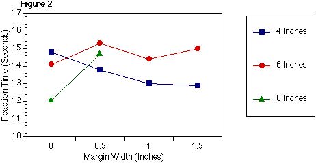
Overall, the results indicated an interaction between text width and margin width. (For the first ANOVA, F(2,52) =4.8, p=0.01) and for the second ANOVA F(3,78) =1.93, P=0.13).When text width was 4 inches, reaction time was much quicker for the larger margin widths. When text width was 6 inches, margin width had a small and inconsistent effect on reaction time. Finally, participants were much faster when the 8-inch text width had a 0-inch border than with the 0.5 inch border. See Figure 2 for a graph of means across all subjects.

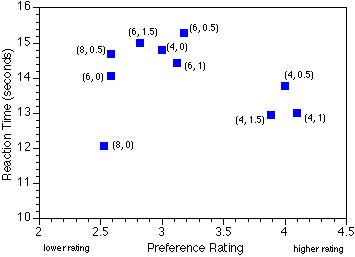
The correlation between preference rating and reaction time performance for the different conditions was non-significant (r=-0.27, p>0.05). However, the scatter plot trend indicated that, except for one condition, participants showed a tendancy to better prefer the conditions for which they showed the best performance. See Figure 3.
Figure 3:

More specifically results participants performed best on 8-inch text width with 0 margin space but disliked that style the most. The highest ratings were given to the 4-inch text width with 0.5,1, and1.5-inch margin spaces, which also showed the highly efficient possessing.
Results indicated that, by itself, text width does not influence readability; however, there was a significant interaction between text width and margin width. The most efficiently read conditions were those with small text width (4-inch) and large margins, or thel argest text width (8-inch) and no border. This supports statements by Mills and Weldon (1987) and Hill and Scharff (1997) that there is no one factor that acts independently to enhance readability.
The lack of correlation indicates that preference does not necessarily lead to optimal processing. Some efficiently-processed conditions are liked by participants while others are not. In general, participants do not like conditions for which reaction times were slow.
Given that webpages on the Internet can be resized by the reader, future research should investigate proportionally-sized text widths in addition to the fixed text width and margin space conditions used in this experiment.
Cook, J. The Sevloid guide to web design: readability.http://sev.co.au/webzone/design/readability.html .
Hill , A. & Scharff, L. V. (1997). Readability of websites with various foreground/background color combinations, font types and word styles. Proceedings of the Eleventh National Conference in Undergraduate Research. (2) 742-746.
Horton, William K. (1990). Designing and Writing Online Documentation, New York: John Wiley and Sons.
Mills, C. & Weldon, L. (1987). Reading text from computer screens. ACM computing Surveys, 19 (4), 329-358.
Morris, M. & Hinrichs, R. (1996). Web Page Design. California: Sun Microsystems Inc.
Rivlin, C., Robert, L. & Davies-Cooper, R. (1990). Guidelinesf or Screen Design. Oxford: Blackwell Scientific Publications.
Siegel, D. (1997). Creating Killer Web Sites. Second Edition. United States: Haden Books.